Back to Home page
UX/UI Design
Grant App
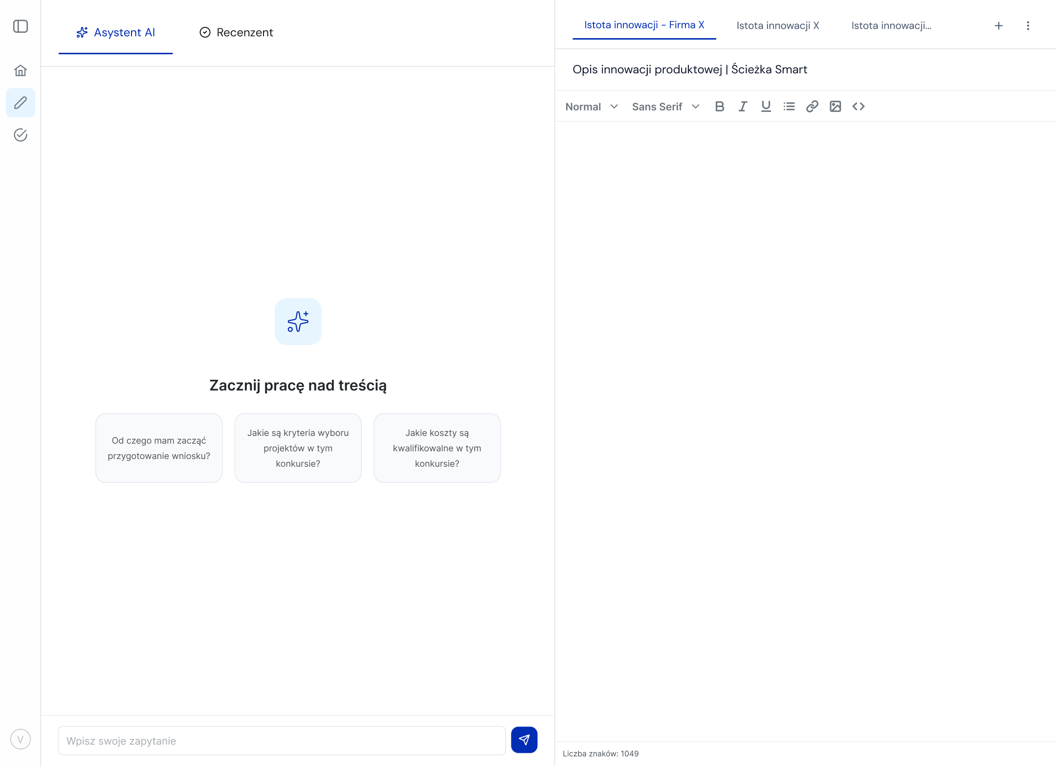
I designed a web application for a startup supporting consulting firms in preparing EU grant proposals. The product helps users streamline their workflow through three core features: an AI assistant for generating and refining content, an integrated notepad to collect and manage key information without switching tools, and a verification module that evaluates proposal text against predefined competition documents. The goal was to reduce friction in the grant-writing process, improve accuracy, and enable consultants to work more efficiently within a single, focused environment.
Role
Product designer
Duration
6 months
Tools
Figma, FigJam, ClickUp
Challenge
Consultants had to navigate a fragmented workflow, constantly switching between tools to gather information, write content, and check requirements. This increased cognitive load and made the process slow and error-prone.
Solution
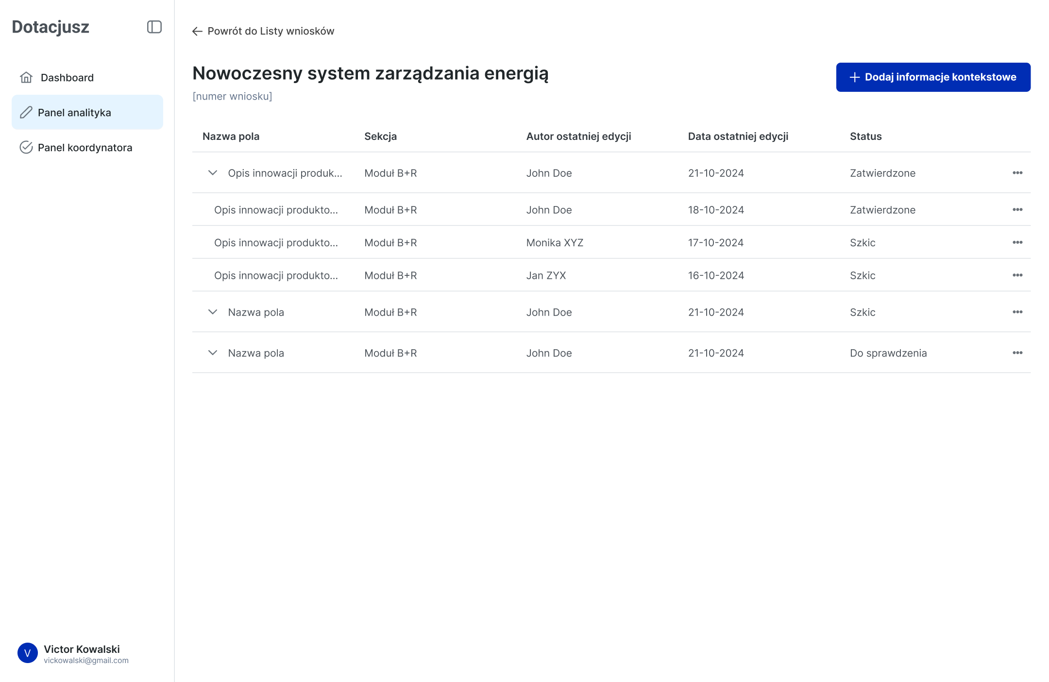
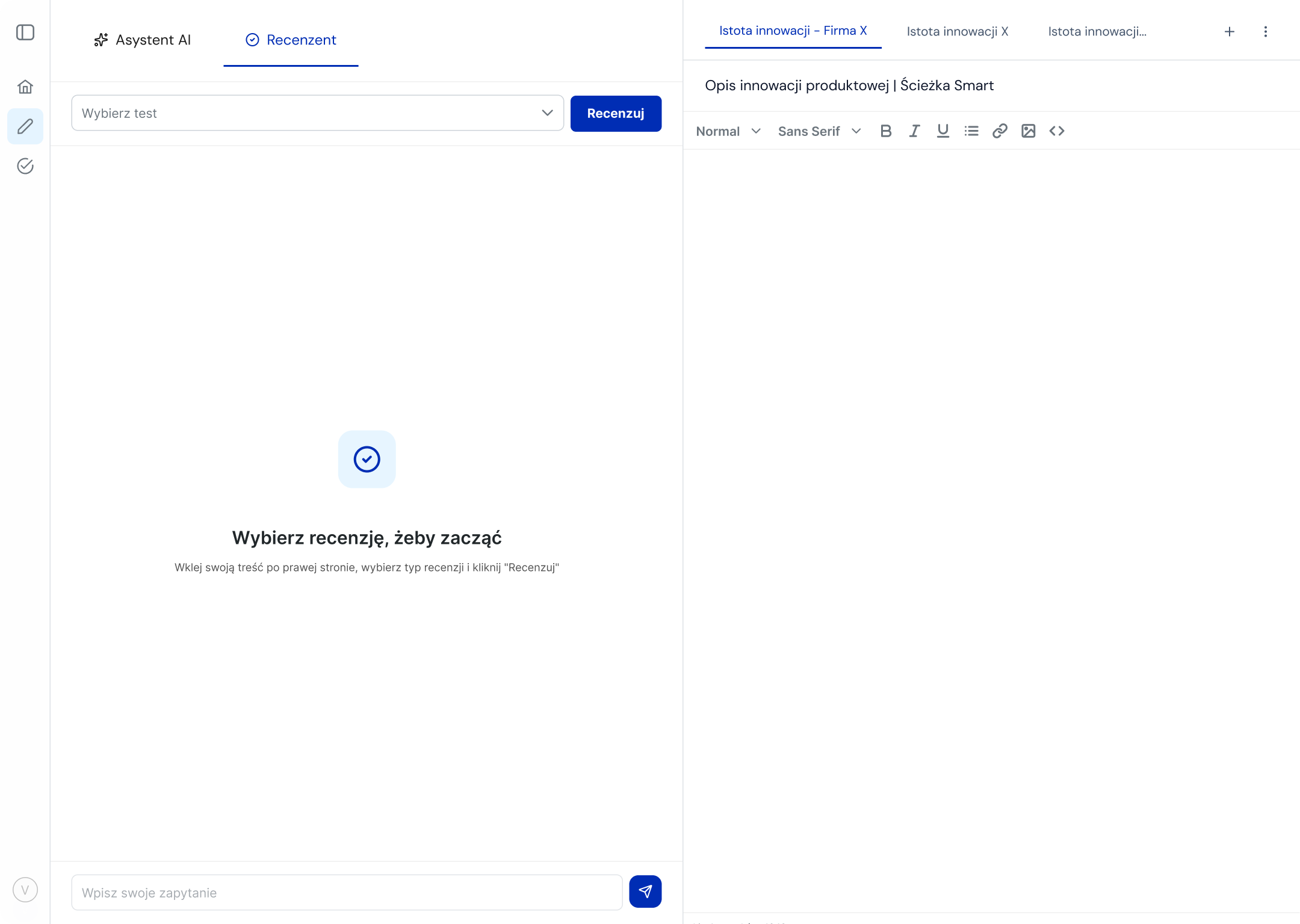
I designed a unified workspace that brought together an AI assistant, a notepad, and a verification module in one place. This reduced cognitive effort and allowed users to stay fully focused on writing. The automated verification feature compared user content against predefined competition documents and highlighted gaps or inconsistencies.
Design Process
1
Stakeholder Workshop & Feedback Sessions
I met with a consulting firm, presented early design ideas, discussed their needs, and gathered feedback to validate assumptions and refine the direction.
2
User & Stakeholder Interviews
I interviewed consultants who write grant proposals and coordinators who review them to understand their tasks, challenges, and decision-making patterns.
3
User Flow Creation
Using insights from interviews, I mapped the complete user journey and designed detailed user flows that outlined how users would move through the product.
4
Wireframing
I translated flows into low-fidelity wireframes, focusing on layout and interaction patterns, and iterated based on early feedback.
5
Usability Testing
I tested the wireframes with target users to validate navigation, task completion, and clarity of concepts. Insights from testing guided necessary adjustments before moving into UI design.
6
UI Design
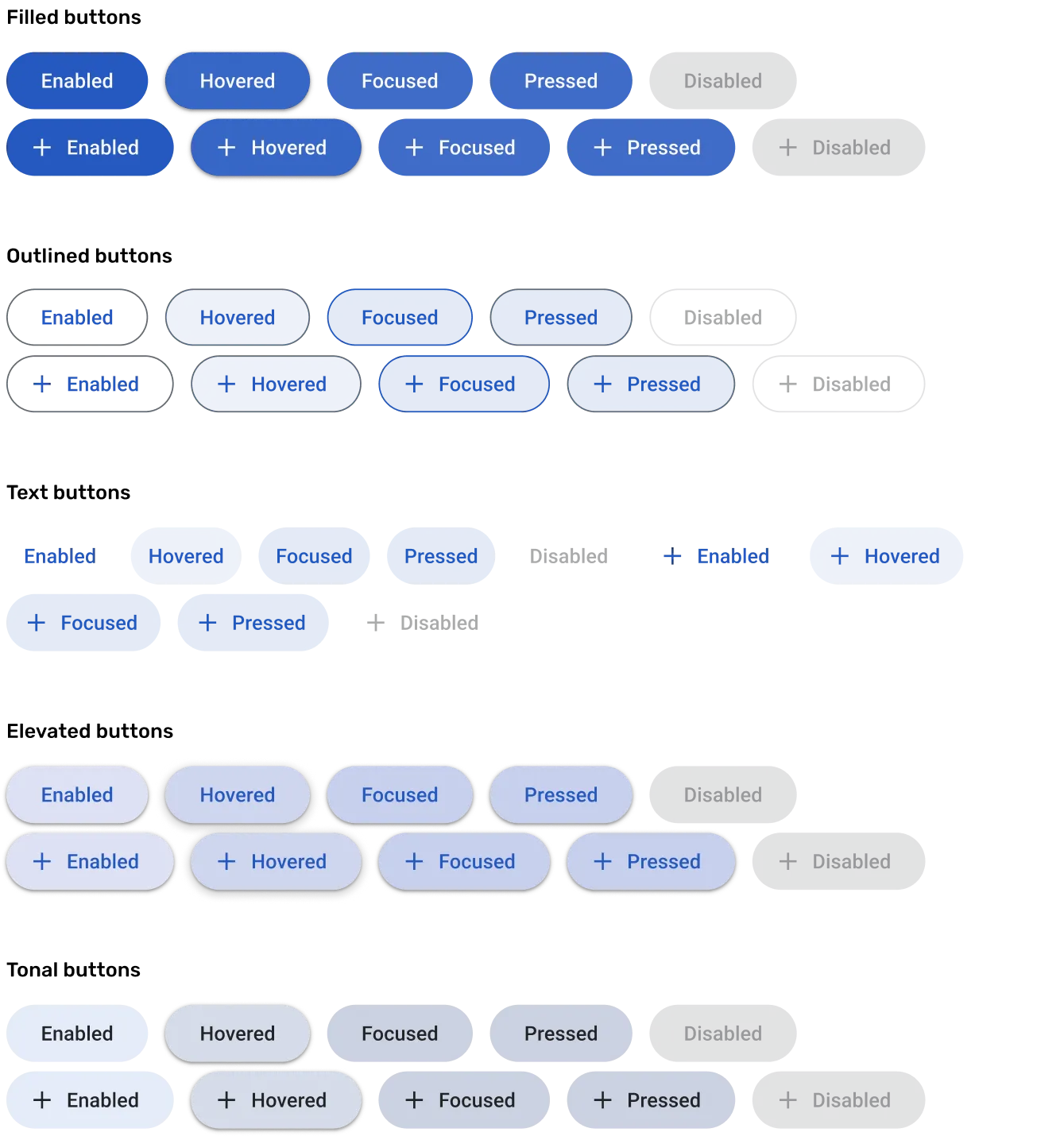
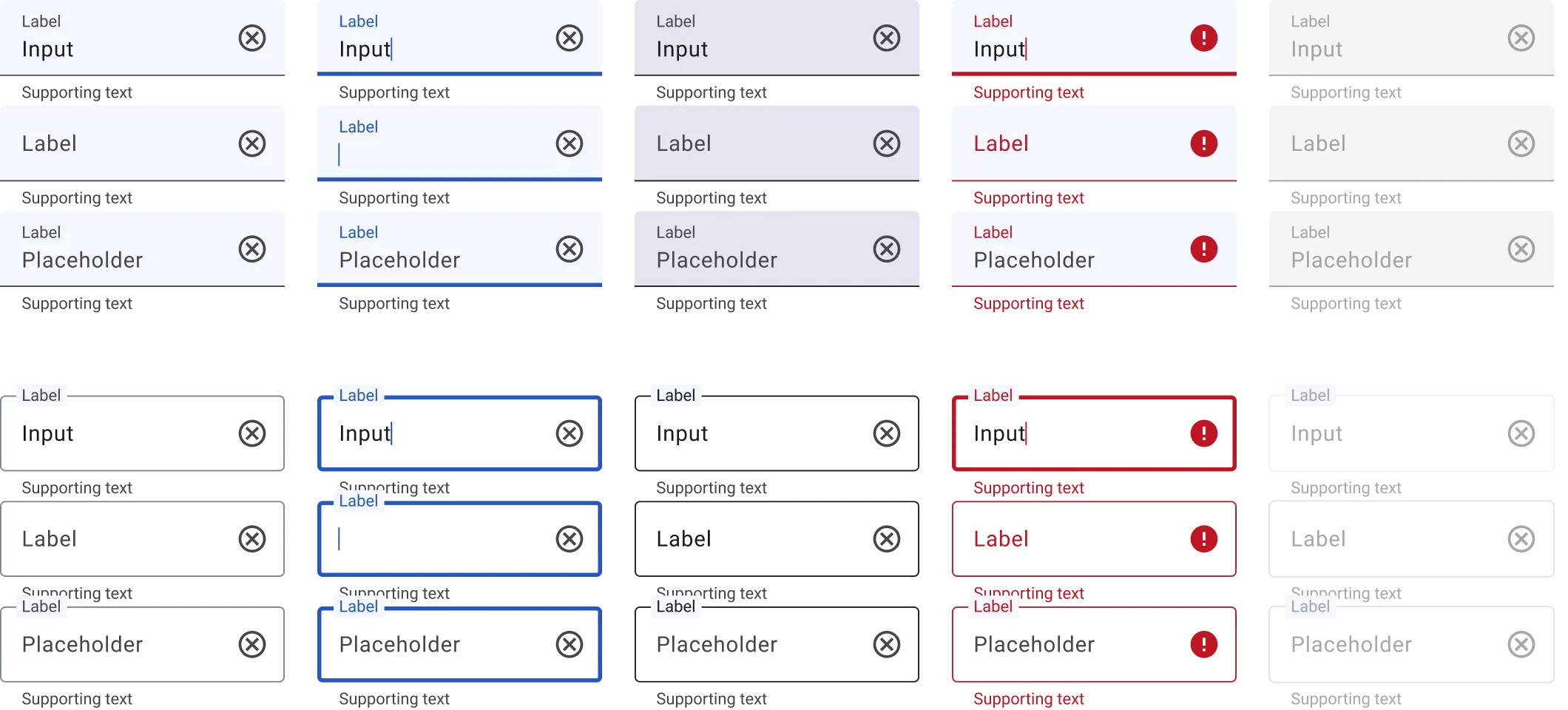
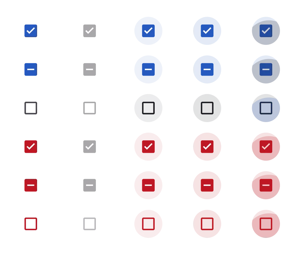
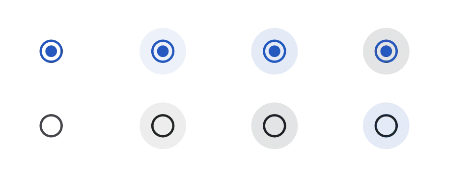
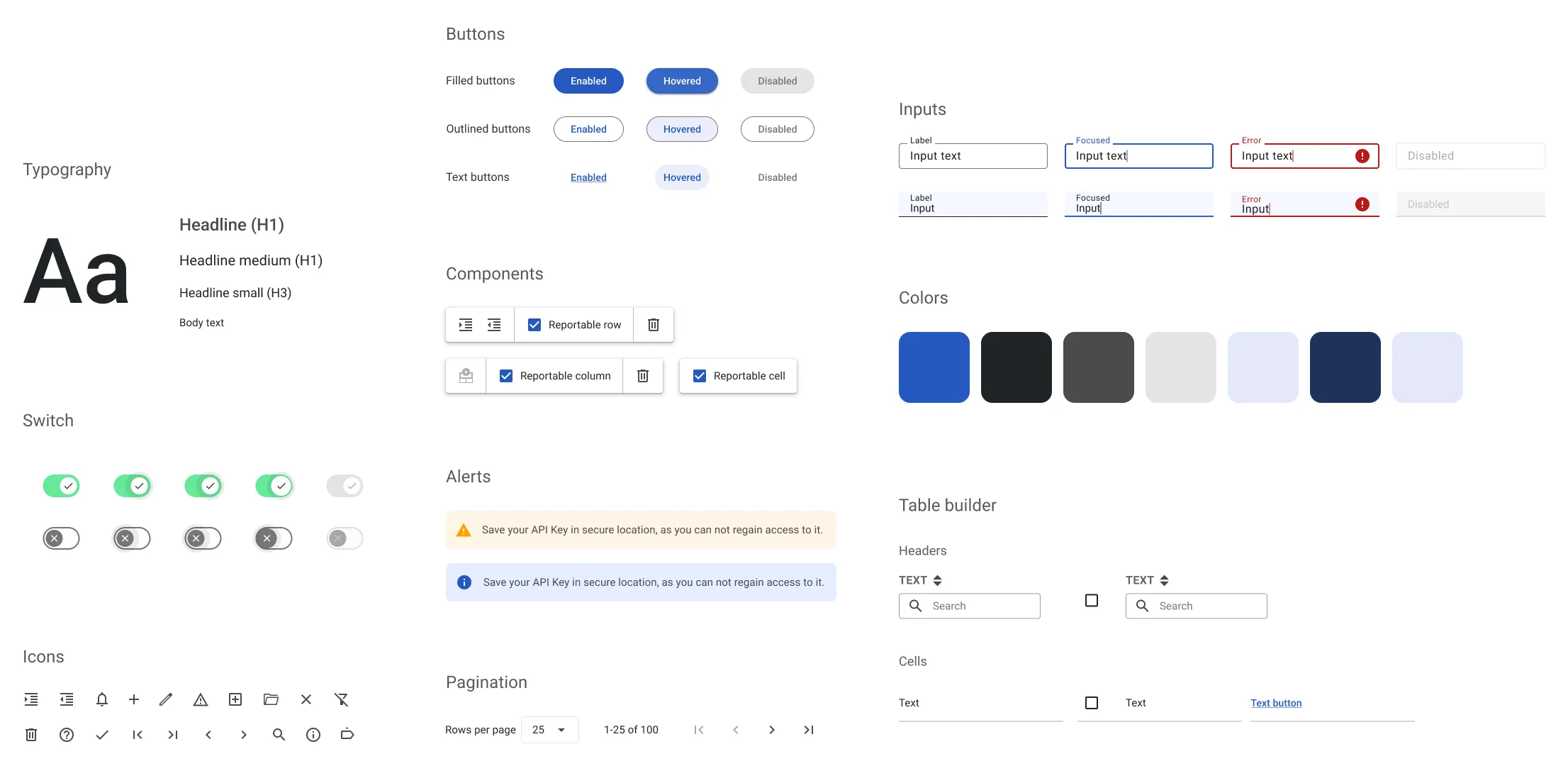
I developed the final interface based on PrimeVue design system, using a clear visual hierarchy, accessible patterns, and consistent design elements to deliver an intuitive and efficient user experience.
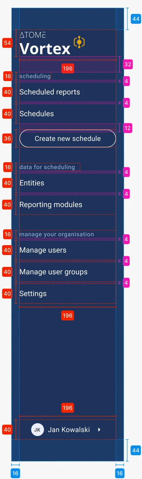
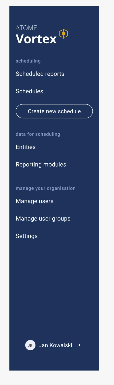
Interface
Outcomes & Impact
Streamlined the grant-writing workflow by consolidating research, drafting, and verification into a single tool.
Reduced time spent on manual checks thanks to automated comparison with competition documents.
Increased accuracy and compliance of proposals by highlighting missing elements and inconsistencies.
Enabled consulting teams to collaborate more efficiently, reducing back-and-forth iterations between writers and reviewers.
88

Enhancing Consistency and Efficiency

with a unified design system

Role

UI Designer

Tools

Figma
The product

The absence of established design rules and guidelines for visual interface led to inconsistencies in both design aesthetics and functional behaviour across the array of products intended for integration into a unified platform.

The problem

Leveraging Material Design 3 principles, we established a design system and style guide. This initiative strengthened consistency across all platforms and provided developers with clear guidelines for interface development.

The result

The introduction of a style guide and design system standardized the visual and functional aspects across various products, enhancing user experience consistency and accelerating the developers and designers work.

Material Design Customization
The main product already launched for clients was developed using the Material Design System. After looking through the user interface, we decided not to change it to avoid extra development costs.
Adapting and building components to fit our interface needs
Defining design principles and guidelines for consistent UX
Establishing accessibility standards and ensuring compliance across all components

Brand Colors

The brand colors were carefully selected to convey a sense of professionalism and trust. The primary palette includes a deep blue for stability and reliability, complemented by a secondary vibrant accent colour to highlight key elements and enhance visual appeal.

The product's original color was yellow; however, blue was chosen as the primary color for the user interface design. This decision was primarily influenced by accessibility considerations and the need for high contrast in buttons and other elements. Yellow was deemed unsuitable for these purposes.

Primary color

The primary color is a deep blue, symbolizing stability and reliability, which forms the foundation of company's visual identity.

Secondary color

The secondary color is strategically used to complement the primary palette and draw attention to important elements.

Semantic colors

Semantic colors are carefully chosen to convey meaning and aid in visual hierarchy within the design system. Each color serves a specific purpose, such as indicating success, warning of potential errors, or highlighting important information.

Info

The "info" color is employed to draw attention to informative content without disrupting the overall visual experience.

Success

The "success" color signifies positive outcomes or completed actions within the interface.

Warning

The "warning" color is used to signify cautionary messages or potential risks that users should be aware of. Its distinct hue commands attention, prompting users to proceed with caution or take necessary precautions when interacting with certain elements.

Error

The "error" color is deployed to alert users to critical issues or mistakes that require immediate attention.

Typography

The typeface used across the system is Roboto, chosen for its modern and clean appearance, which enhances readability and ensures a consistent user experience across all digital products.

Components

The UI interface was created by using pre-prepared components from a library, making the design process faster.
To simplify the developer team’s work, each design includes annotations clarifying the purpose and behaviour of each element. This ensures common understanding and simpler implementation during the development process, reducing the need for multiple iterations.

Buttons

Buttons are essential interactive elements within the design system, facilitating user actions and navigation throughout the interface. They are designed with clarity and consistency, featuring prominent colours and clear typography to encourage user engagement.

Inputs

Inputs serve as entry points for users to interact with and input data into the system. They are designed to be intuitive and accessible, with clear visual cues such as placeholder text and border states to guide users.

Checkboxes & radio buttons

Checkboxes and radio buttons are essential form elements that enable users to make selections within the interface. Checkboxes allow users to choose multiple options simultaneously, while radio buttons restrict selections to a single choice from a list.

Dialogs

Dialogs are modal windows that appear in response to user actions, such as alerts, confirmations, or prompts for additional information. They provide a focused interaction experience, temporarily suspending activity in the background while users attend to the dialog's content.

Calendar

The calendar component provides users with a visual representation of dates and allows them to interactively navigate through time. Designed for clarity and ease of use, it features intuitive controls for selecting dates, such as arrows for switching between months and a clickable interface for choosing specific dates.

Project summary

The project focused on creating a design system for three products, aiming to merge them into one platform.
Style guide was developed to ensure consistency across interfaces and streamline future development.
By implementing a style guide and component library, we improved development efficiency and maintained a consistent user experience across all products, benefiting the company.
This approach saved time for developers and simplified updates and feature additions.

Skills

Design System
Style Guide
User Interface
Cross-team cooperation
Let’s get in touch

Whether you're looking for a passionate UX/UI designer for a permanent role or need a creative mind for freelance projects, I'm here to help. Feel free to reach out—I'd love to chat about how we can work together to create amazing user experiences!

Created with Figma & Webflow by Julia Domagalska